
27th October 2014
Stefan Sagmeister
I came across the Graphic Designer Stefan Sagmeister who created a book called 'Things I have learnt in my Life so far'. Within the book Stefan goes he typographically illustrates lessons hes learnt through his life, design and being human. Stefan uses different environments to illustrate the type. The message is always clear and straightforward, the typography much more ambiguous and open for interpretation. Stefan found by presenting this work and using a clear message the viewers have an easier time relating their own experiences. Some are influenced by the environment where the picture is taken, some by an outside person and some by a personal experience.
Since I am hoping to also use type in an environment I've taken real inspiration from Stefan's work.
Since I am hoping to also use type in an environment I've taken real inspiration from Stefan's work.
28th October 2014
Typography in the Environment
For the Point to Pixel project I want to show type in an environment. I have two main ideas so far; the first is to hang type from trees in the forest. The type letters will either be cut from either a photograph or transparent paper and hung using transparent string. If the letters are cut from transparent paper I want to use Powder paint to chuck at the letters so they become visible.

20rd October 2014
From Point to Pixel Ideas
For the Point to Pixel brief I want to show type in a natural environment. I like the idea of the quote/word being hidden within its surroundings. I also know that I want the outcome to be moving image, a short film. Two of my ideas involve hanging typography with transparent string so they dangle in the trees. I think I would also use transparent paper but I thought I could also try using photographs cut out into letters. Either photos of the same environment so they are hidden or perhaps using contrasting images which link with the word of quote.
I decided to test the photography idea out but It didn't quite go to plan. I wanted to write a word but it began to poor down with rain to I only managed to use the letters t and o. Although I did get heavy rain sounds for the Organic Kingdom project. Even though it didn't go to plan I still used the videos I took and made it into a short film. Because of the changed in weather the lighting compared to the letters were completely different. Also because it was raining I'm not very steady and the footage shakes. I want to try using transparent letters next time and using colored powder to show the word.
29th October 2014
Powder Paint
One of my ideas involves using Powder Paint to help show hidden Typography. I want to hang letters in a environment using Transparent paper and string. Then chuck powder paint at the type to make it seen. I have never used powder paint before so I don't know whether or not it will work.
I came across this video called Colourfornia. If I can get the same effects with the powder paint as they have I think it will be very effective. I want the location to be in the forest so I need a contrasting colour which will stand out, like red/orange/pink. I also need to think whether I want to use more then one colour or to keep it simple with just one. I also want to look into slowing down the pace of the video to show the full effect off the powder.
The only thing I am concerned about is the weather. If its too windy the type won't stay still and the powder won't work as well. I need to experiment and test it out so I know whether it will work well enough or not.
I would like to create a short film and possibly take pictures (or use screenshots) at the exact moment you can see the type and create a poster.
I want the video to begin with just the environment. A few shorts of the location, trees, close ups of leaves then go into the type. Perhaps film the paint without the type to start to introduce it.
30th October 2014
Transparent
 |
| Click for video |
31st October 2014
Development. Colour meaning
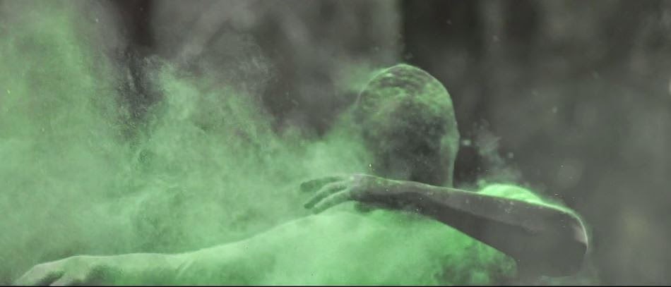
I'm going to start testing out and experimenting with my idea of hanging transparent letters in trees and making them visible. I have also developed the concept of the video more. I want to hang the word O2 (the chemical name for oxygen) and use powder paint to show the letters, playing on the idea that oxygen can't be seen.

I also want need to think about the colour of the powder paint and why. I need the colour to be bright and not blend in with the background.
In chemistry when they build molecules (ball and stick models), oxygen atoms are red. I think red powder paint would work really well as it will contrast from the background and be easily seen.
I also need to play with the type. When O2 is written the 2 is subscript. I want to represent it as true as I can so I will try to make the 2 smaller and hang it below the O.
6th November 2014
Video Inspiration


I came across this video on Vimeo which has really inspired me. The lighting is very intense and creates a very mysterious mood. I would like to edit my moving image to be similar to this. There are also a lot of different shots used within this video, rather then fading together it first fades to black then back to the video. I also think this would work really well for my video.
I will be editing the lighting in post production but I also think it would be good to go when the light is starting to fade for the lighting effect I want.
11 November 2014


Lighting
This weekend I went to the forest to take some practice shots. I also took some pictures to test the lighting. I want the lighting to be quite dark, although I don't want it to look over edited.
I played around with the pictures I took to get the effect I wanted. I like the look of the image being darker around the edges and all the focus in the middle of the shot.
When I tested the powder paint out a lot of it feel onto the ground. I'm not sure if I like this effect and if I want to include it. I could play with the idea that I'm making oxygen visible and show it on plants leaves etc (to show photosynthesis).
12th November 2014
Moving Image Testing
I only tested a small amount of the powder paint as I didn't want to waste it. I will have to use a lot when I film my outcome. Although I also want to look into coloured smoke to see if that would work better. I'm not sure if I would be able to use that in a forest however but it might be more effective then powder paint.
15th November 2014
Video Editing
I now need to incorporate the typographic principles into my work. I thought I could perhaps create a series of posters from stills/photographs from my moving image. Within each poster it would show what typographic principle is being shown. I will do this as extra development If I have time, but I want my moving image to be my main outcome.
I tested out putting type into my video. Obviously this is just a tester and doesn't show any typographic terms yet. However in my final outcome I will use the type O2 to demonstrate each principle.
19rd November 2014
Fitting to the Brief...
 I ended up becoming very confused about what the Point to Pixel brief was actually asking of us.
 Asking speaking to the tutor about this it turns out that I needed to use typographic principles.
Originally I though we that we could either chose to show type in an environment (which I was doing) or typographic principles, I didn't realize we had to do both.
This did really frustrate me as one of the tutors had previously seen my work and told me it fit the brief. It's fair enough to say that I panicked and stressed out about how I could develop my original idea to fit the brief. Although I am still not 100% sure on the brief, whether we need to teach people typographic principles or just use them within our work.
I looked into ideas for both and really struggled with coming up with an idea which followed my original one. I designed some posters but I never felt very passionate about any of them.
I also spend a whole day designing and creating an alphabet made from organic materials (leaves, twigs etc). Although again I didn't feel very passionate about this. I tried developing it into a poster but I still didn't want to continuing developing it.

23rd November 2014
DVD Cover
None of my previous poster idea connected to original idea, my moving image.
I then began to think about ways of being able to keep my Moving Image as it is (as I had already planned, filmed and edited it) and create something additional which would link to the brief.
I then came up with the idea to burn my short video onto a DVD and create a case for this. The case itself would show the typographic principles.
I still wasn't sure whether we needed to explain what the six typographic principles meant or just needed to demonstrate that we can use them.
I didn't want to go completely of track so I decided to just use them within the packaging and talk about O2.
Design Inspiration:
 Since my subject is Oxygen and I need to show lots of different type I instantly thought of a book. I wanted to design a case that looked like a book. Having a front and back cover and writing on the inside. Although I still would need to think for it to also hold the DVD. I didn't want to create a traditional design for the CD holder, I wanted it to be part of the book.
Unfortunately since I didn't realize my project didn't meet the brief till two weeks before deadline (and I still needed to complete my other projects) I didn't have very much time to develop an idea. If I had more I would have liked to create something similar to this. With many pages inside the book.
24rd November 2014
Case Design

I wanted to base my packaging design around a book design. So that when you open the book there's information on either side, like there would be in a book.
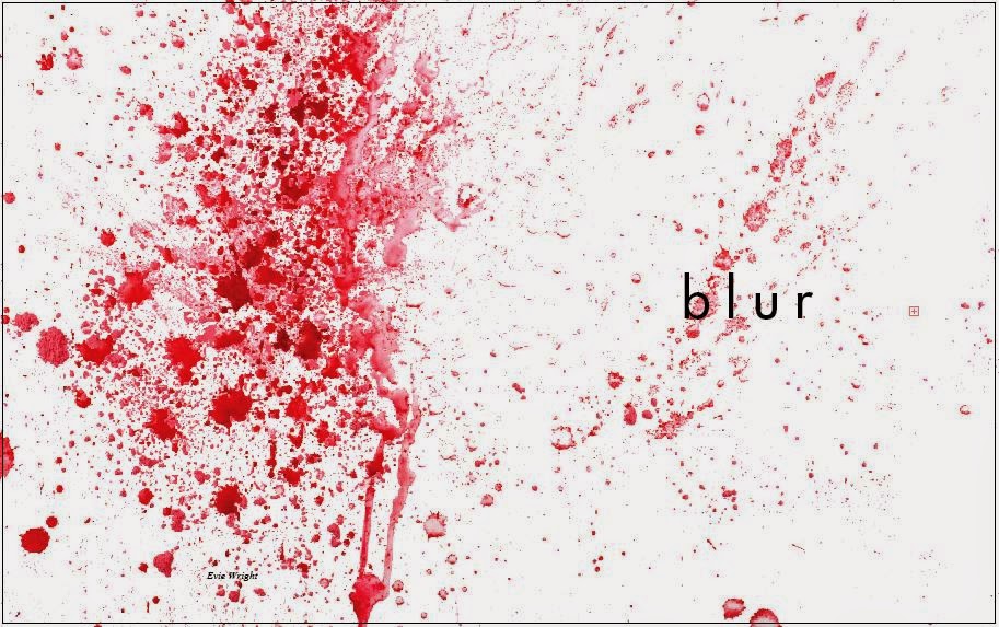
I created the cover by chucking powder paint onto white paper and photographing it. I wanted the back to have a lot more on it then the front so it doesn't distract from the title 'Blur'.
I chose to use 'Blur' as the title for my case as that's what I wanted to show within the actual video. When the powder paint is on the O2, it looks blurry.
When you open the book I've designed it so that the DVD will be in the middle. I did this by simply cutting a slot in the middle the length of a CD.
I displayed the information using different typographic principles. On the right I used Alignment and on the left I made a very obvious river.
25th November 2014
Final Outcome